As an Interaction Designer & Illustrator at Melio, I lead the creation of our visual system across product and marketing- developing the brand mascot, illustrations, iconography, and core brand design guidelines.
My role blends systems thinking, interaction, and storytelling to shape a cohesive and flexible visual language used company-wide.
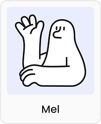
This is Mel
Mel is Melio’s brand mascot and a central figure in the illustration system. He is designed to be friendly and relatable, helping humanize the brand and create a connection with users.
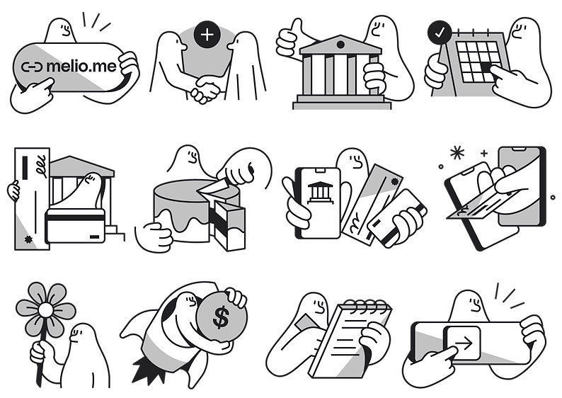
Mel's main goal is helping users navigate the product with ease
and making complex processes feel simpler and friendlier

It brings something unique and provides a consistent, relatable, and friendly face for the brand

By creating a personal and deep connection between user and product, it helps convey complex information in a simplified way that identifies with the user, and can be used across various platforms

Mel appears in the product and in the marketing materials in order to guide users through the different processes and explain how to use the platform.

![Mel mobile app [melio]](https://static.wixstatic.com/media/416448_d49dd99b430f485ba0a0da21b5d93747~mv2.png/v1/fill/w_743,h_503,al_c,q_90,usm_0.66_1.00_0.01,enc_avif,quality_auto/Mobile.png)
We chose the name “Mel,” a gender-neutral choice inspired directly by the brand name. This strengthens the mascot’s connection to Melio while being approachable and inclusive.


Visual Traits and Personality
Mel is a unique character — neither human nor animal and intentionally genderless. With a neutral expression and no mouth or eyebrows, Mel’s look is clean and neutral, which helps keep the character relatable yet serious.


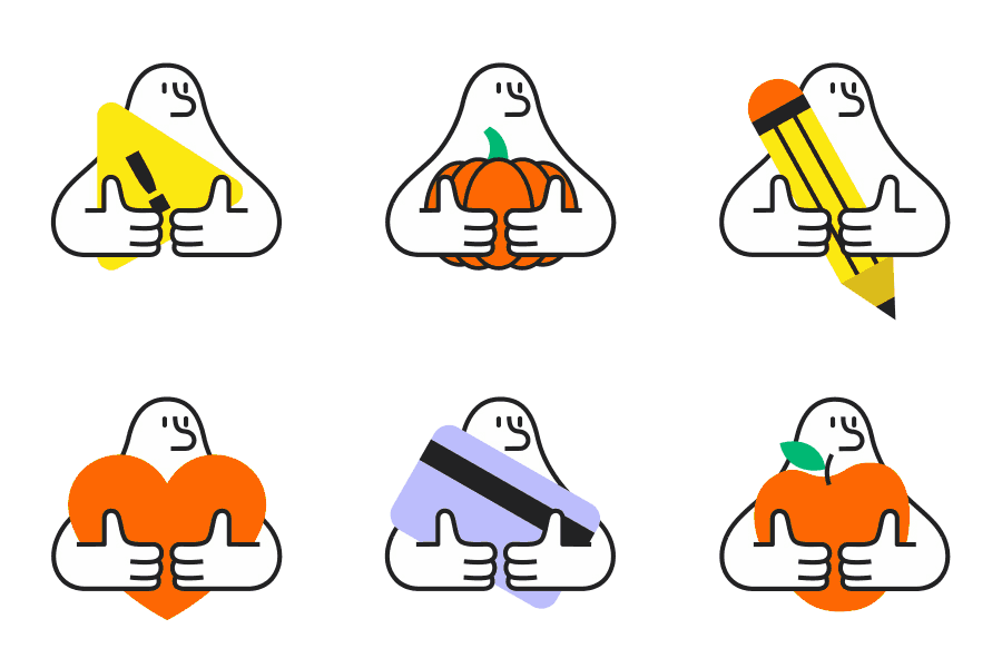
It's appearance is consistent with a black outline and a white or transparent fill,
though other elements can appear in color when needed.
Design and Style
Mel’s appearance reflects the brand’s visual style- simple, modern, and delightful.
As it was developed as part of Melio’s rebranding process, we ensured it would harmonize with the company’s other new visual elements.


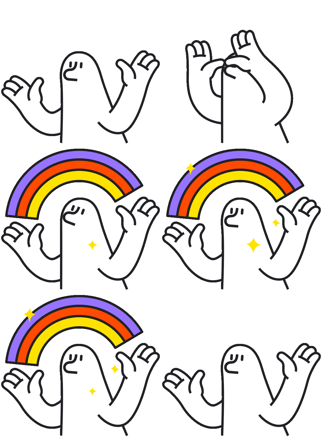
The design is versatile, enabling Mel to appear in different poses or situations,
creating a cohesive yet varied visual language.


Product kit
To support both Melio’s product experience and its partner ecosystem, we developed two complementary illustration kits built from the same visual foundations

Melio Kit
A set of illustrations featuring Mel- designed specifically for Melio’s core product.
This kit helps communicate product flows, explain complex concepts, and guide users with a consistent, friendly visual tone, all while maintaining the brand’s visual language.





Partners Kit
A more generic, brand-agnostic illustration kit created for Melio’s external partners.
Built on a flexible color palette that allows each partner to apply their own brand colors, this system gives partners the freedom to align the visuals with their identity while still preserving a cohesive illustration style.

Icons
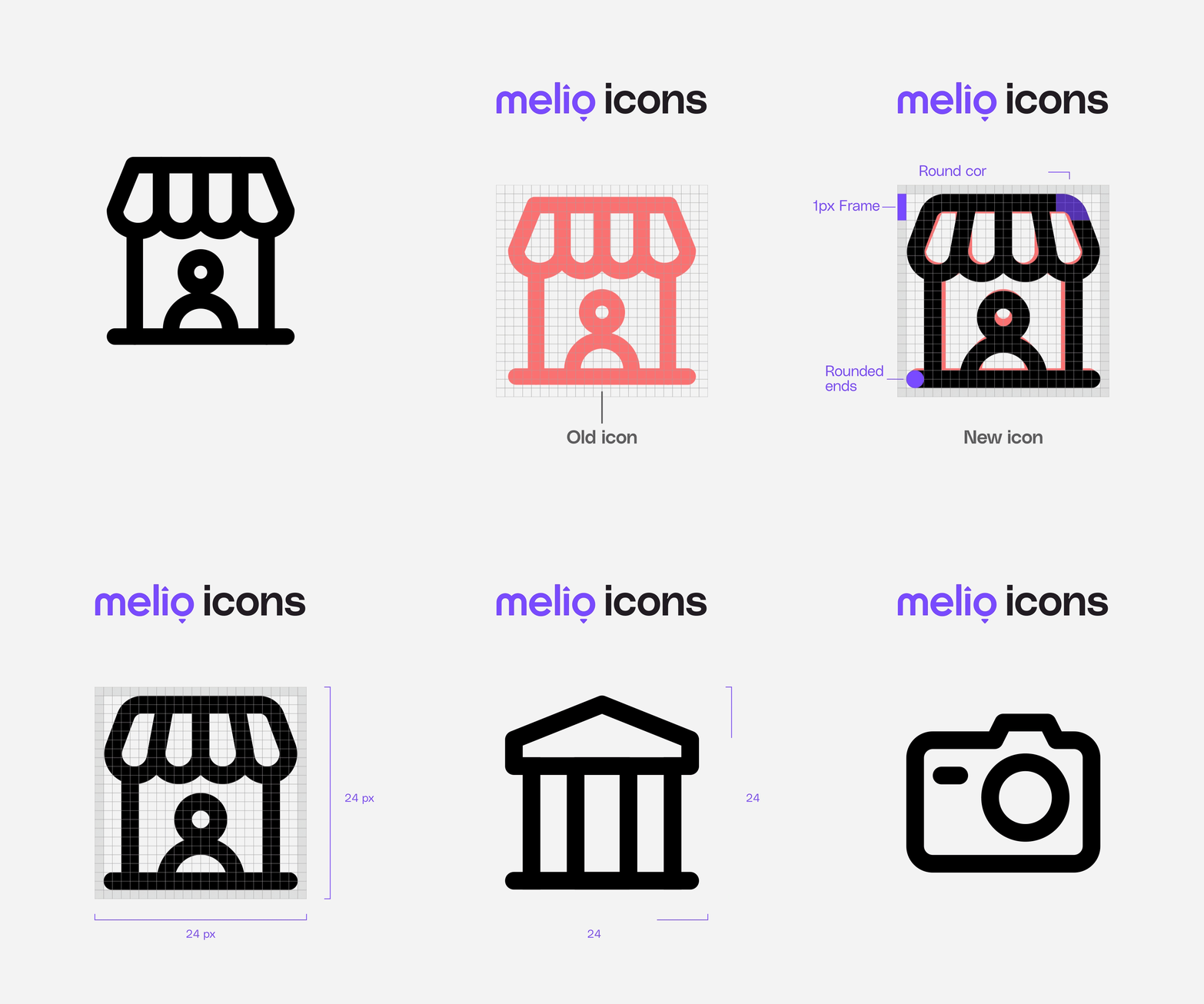
The Melio icon bank contains over 300 custom, pixel-perfect icons
designed as a unified system across product and marketing.
Grid & Sizes
Each icon is designed in two sizes- on a 16px grid and on a 24px grid,
ensuring flexibility across different product contexts.

Here’s a comparison between the design principles behind the large and small icons,
including line weight, rounded ends, padding, and corner radius:


Credits
Creative direction - Neil Cohen & Guy Tubul
Brand designers - Yuval Asis, Tomer Azulay Yasmin Malki, Lika Marutian


